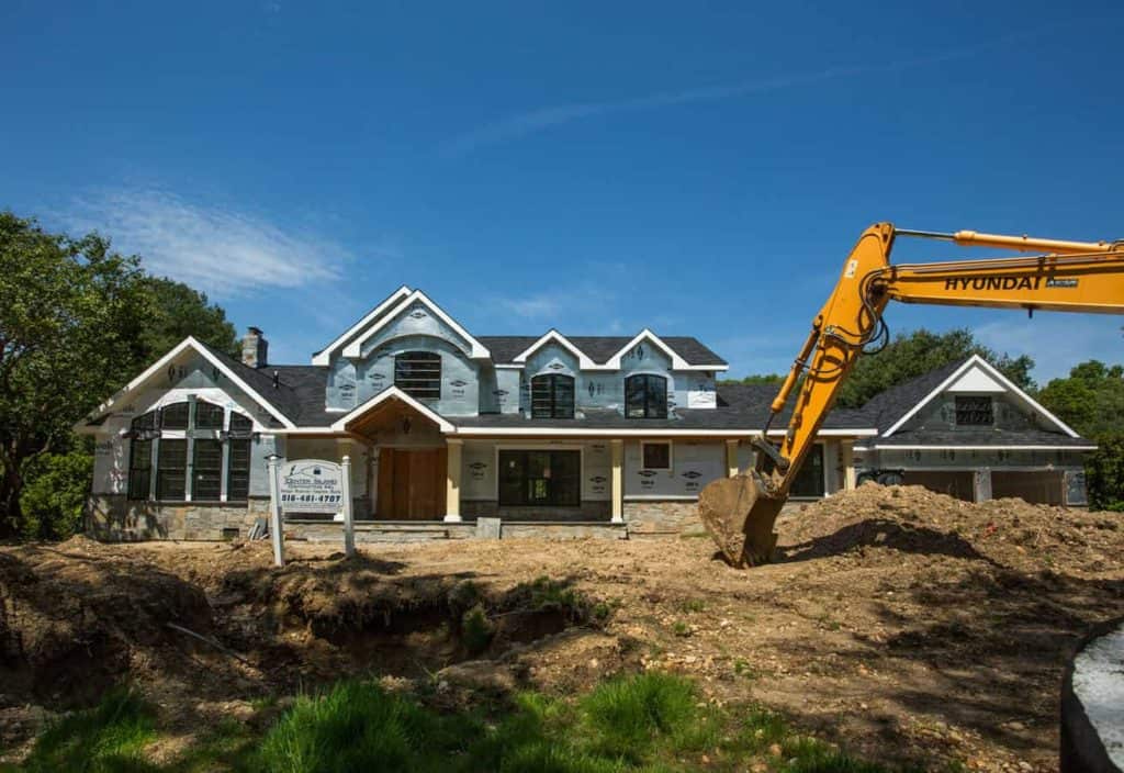
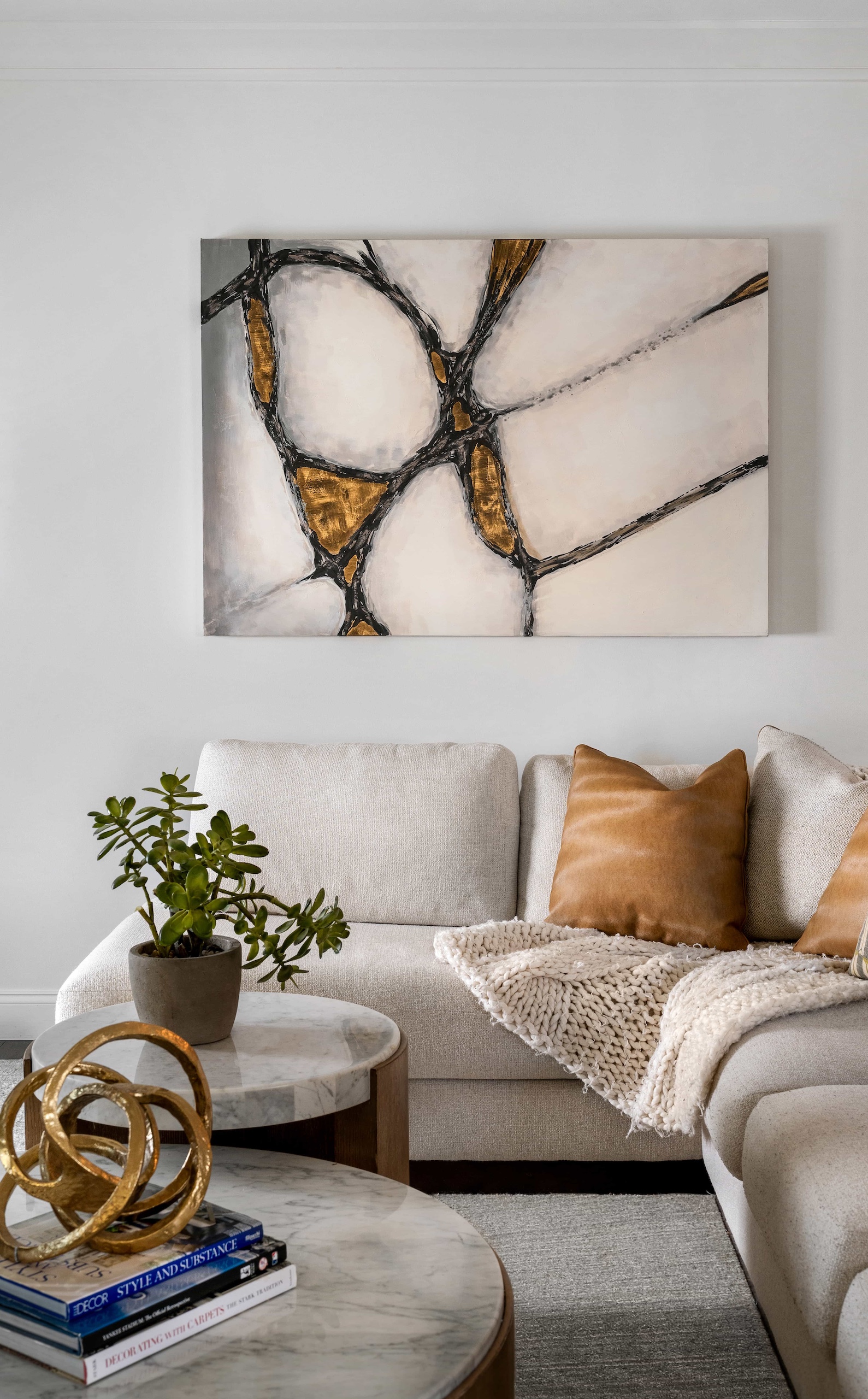
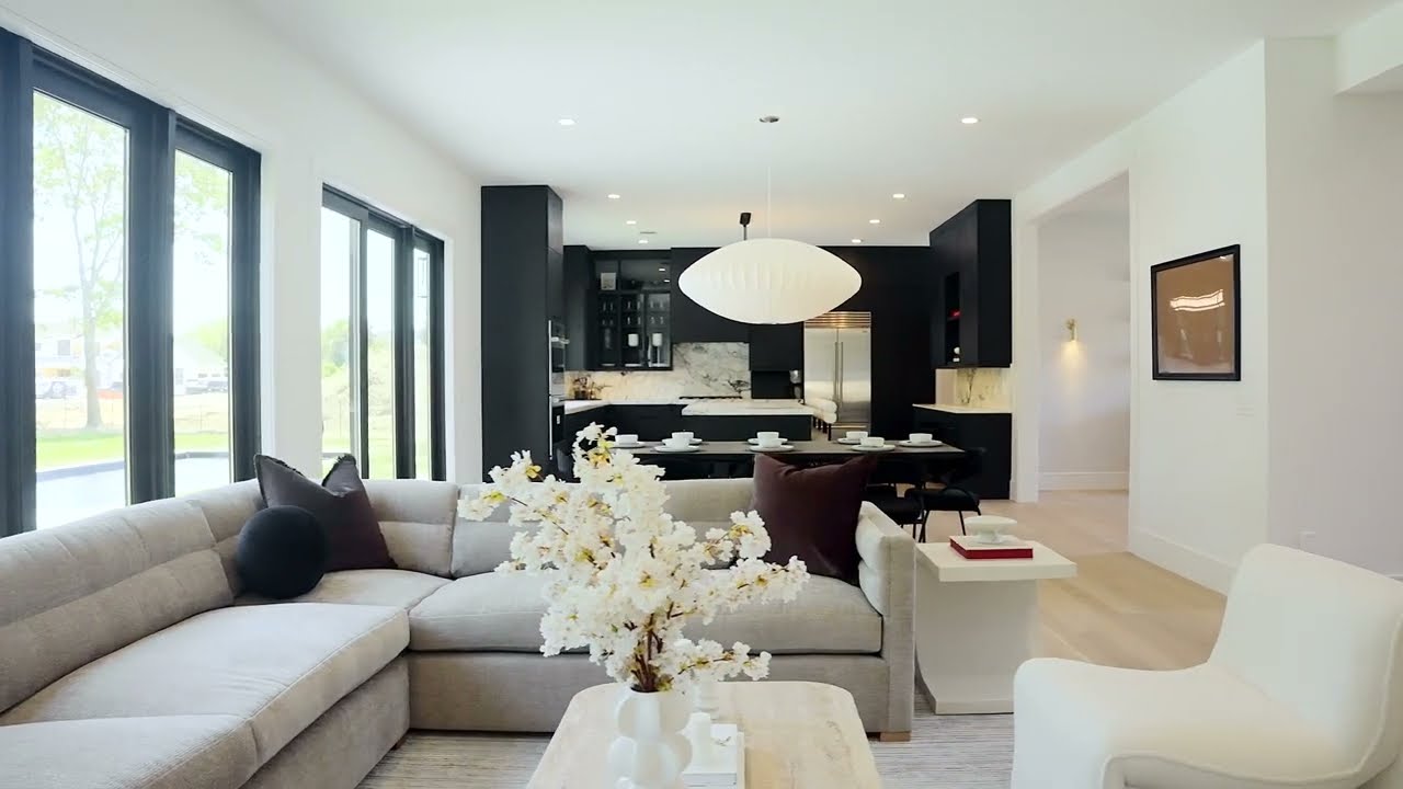
While we await our final, professional photos, I’d love to share a complete home renovation project I was honored to work on. My clients, Marissa and Michael Cohen, in Old Westbury, decided to take on a complete renovation and re-do their 80’s-style home. Below is an original sketch of the home’s design.
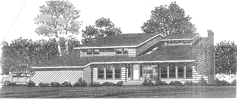
In the renovation design, the piano room was expanded by six feet and the ceiling was raised (left front of house in photos), and the garage was moved to the right side in a separate extension.

This resulted in the outside of the home taking on a completely new and updated look.

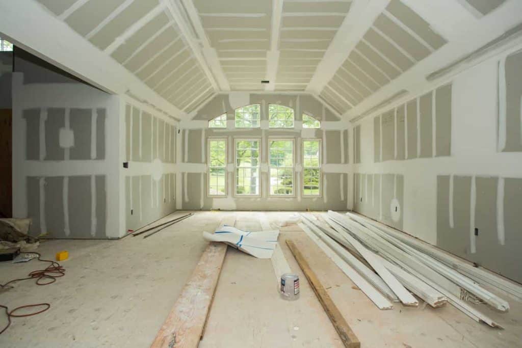
Interior design was crucial. Look at the photo below of the piano room as it begins to take shape after drywall. Eight gorgeous windows light up the room.
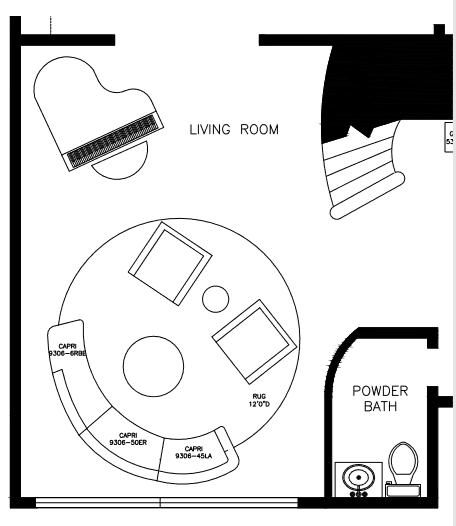
Below is a sketch of the floor plan showing how the furniture will be arranged.
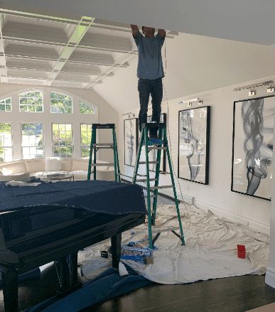
From Day 1, I envisioned a wall of artwork, which I knew would make an amazing statement. Once the artwork was installed, it added a total element of surprise to the room and became the “wow factor.”

To mimic the curves of the piano, I discussed with my client purchasing a circular blue area rug, and accenting with a cream-colored sofa. When looking at pictures of this home currently, people might feel that this home would not be family-friendly. On the contrary, every fabric used in the entire home was a Crypton-grade fabric which, in its invention, is a very durable, stain-resistant fabric that can take the use of any active family.
During the initial client meeting, I always like to get a feel of what my client likes and what colors they gravitate toward. In this case, Marissa led the way. The rug in the fireplace place room was our jumping off point. It set the stage for the entire home. At times, clients question this method. However, after designing many amazing homes for over 15 years, I know that it’s about finding something your client loves. Then, it becomes the job of the designer to expand upon their preferences, and mood boards are always a great way to help the vision come to life.
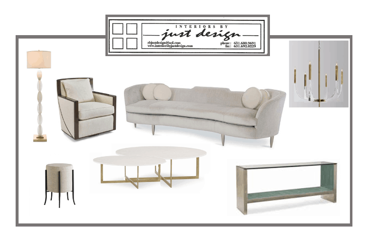
Although the fireplace room is still under construction, our statement rug is softened by the simplicity of the cream-colored furnishings. I am a big believer in keeping it classic and allowing the chosen focal point to speak volumes.
The fireplace wall is a wood panel design that I envisioned, and is in the process of becoming a gorgeous reality. To add to this, we are fabricating a limestone mantle, adding alabaster floor lamps, a new cocktail table, as well as a console table. These elements are still on the way.
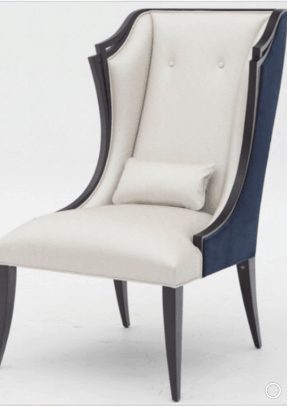
In the dining room, the unique and glamorous chandeliers from Kravet are quite the stand out against the blue silk wallpaper. The Christopher Guy host and hostess chairs anchor the simple but elegant dining table. The area rug, again, calls you in and says wow!
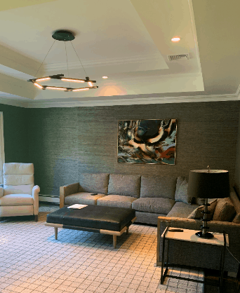
Since the feeling of this home was elegant, regal, classic and refined, I wanted the den to be warm and comfortable. I love the use of a dark grass cloth on the walls to create that feeling. The tones played off the clients’ art collection. Once again, the use of stain-resistant fabric on all the pieces in this room enables the client to entertain without any concerns.
I can’t wait to share our completed photos as we are a few weeks off from adding our finishing touches.
Stay tuned!
