Interior paint color trends come and go, but there are many ways of predicting what will be trending next. Each new year, Pantone (a company considered the leading authority on color and color matching) releases their color trend forecasts for the upcoming calendar year, and the nail is always hit on the head. The year 2017 is approaching quickly, and Pantone has announced that color is back in a big way! We’ve moved on from minimal and muted to bold and beautiful, although not every designer will follow these trends. From my experience, I prefer to go with a more timeless design than an “in your face” trend that will fade over time. Learning how fads come and go is an interesting and an ultimately successful way to make sure your design stands the test of time.
Here are some colors that are trending for the year 2017:
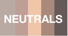
Neutral colors evoke feelings of warmth and comfort. The taupe and khaki family continue to be important, but for 2017 Pantone has also added added in a variety of warmer and more classic taupes including Hazelnut.
PANTONE 14-1315 Hazelnut
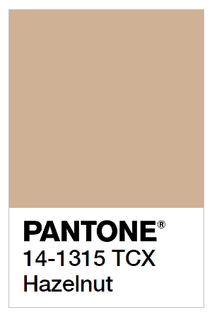
Hazelnut is a key neutral for spring 2017. This shade brings to mind a natural earthiness. Unpretentious and with an inherent warmth, Hazelnut is a transitional color that effortlessly connects the seasons.
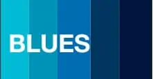
The color palette of blues keeps becoming more nuanced. To broaden Pantone’s palette of blues for 2017 they added varying degrees of watery and more vibrant aquamarine blues with names like Iced Aqua, Deep Lagoon, Ibiza Blue and Island Paradise.
PANTONE 14-4620 Island Paradise
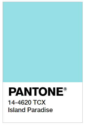
Island Paradise is a refreshing aqua that calls to mind a change of scenery. A cool blue green shade that speaks to our dream of the great escape, Island Paradise is emblematic of tropical settings and our desire to unwind.
PANTONE 17-4123 Niagara
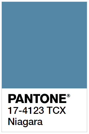
Niagara gives a colorful punch to any design with elegance while keeping the design fresh. Comfortable and dependable, Niagara leads the PANTONE Fashion Color Report as the most prevalent color for spring 2017. Niagara is a classic denim-like blue that speaks to our desire for ease and relaxation.
PANTONE 19-4045 Lapis Blue
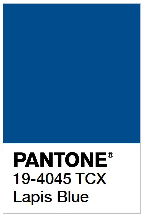
Lapis Blue is a deep blue that lends its energy and liveliness to clean design. Strong and confident, this intense blue shade is imbued with an inner radiance.
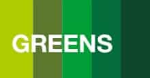
The continued influence of the green family led to the addition of a wide array of green shades added to the Pantone palette for 2017, ranging from the natural and earthy warm yellow-greens like Guacamole and Split Pea to the true green shades of Lush Meadow, the olive-infused Sea Turtle and Kale.
PANTONE 18-0107 Kale
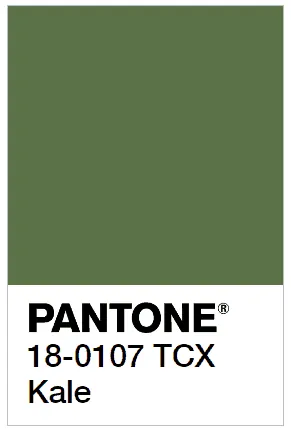
Evocative of the great outdoors and a healthy lifestyle, the color Kale is another foliage-based green that conjures up our desire to connect to nature, similar to the more vivacious Greenery. Fresh and earthy gives a subtle hint of color while keeping your design grounded. And, just as we see in nature, this lush and fertile natural green shade provides the perfect complementary background to the more vibrant tones in the palette.
PANTONE 15-0343 Greenery
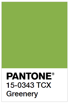
Bringing forth a refreshing take, Greenery is a tangy yellow-green that speaks to our need to explore, experiment and reinvent. Illustrative of flourishing foliage, the fertile attributes of Greenery signals one to take a deep breath, oxygenate and reinvigorate.
Stay tuned to our blog for more interior design paint color trends for 2017.
